i Short answer
An equity curve plots your account balance over time as a simple line chart, revealing performance patterns, consistency, and drawdown periods.
This often shows things that summary statistics alone, like average return, can obscure.
📋 ON THIS PAGE
1. What an equity curve actually shows
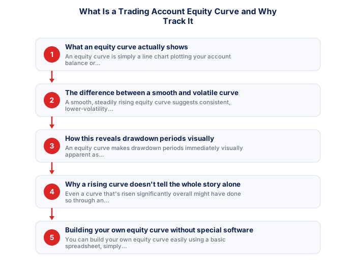
An equity curve is simply a line chart plotting your account balance or equity at successive points in time, typically after each trade or at regular intervals, providing a visual, intuitive representation of how your account has actually evolved over your trading history.
Building consistent trading results in South Africa requires applying disciplined principles across all aspects of the trading process. Many of the challenges South African traders face - from load shedding interruptions to rand volatility around political events - are manageable with the right preparation and risk framework. Approaching each session with a written plan, defined risk parameters, and clear criteria for entry and exit transforms trading from reactive to systematic.
2. The difference between a smooth and volatile curve
A smooth, steadily rising equity curve suggests consistent, lower-volatility performance, while a curve showing dramatic spikes and drops, even if it ends at a similar overall point, suggests considerably more volatile, less consistent underlying performance.
Choose FSCA-regulated broker
Verify the FSP number is current at fsca.co.za.
- South African ID or valid passport
- Proof of residential address dated within 3 months
- Proof of bank account ownership
- Selfie or photo for biometric verification (some brokers)
- Source of funds declaration if depositing above threshold
Submit FICA documents
SA ID, proof of address within 3 months, bank account proof.
Fund via EFT
Make the initial deposit from your SA bank account in ZAR.
Open demo account first
Practice on demo before activating your live account.
Start with minimum capital
Begin with an amount you can afford to lose while learning.
3. How this reveals drawdown periods visually
As, an equity curve makes drawdown periods immediately visually apparent as declines from a previous peak, providing a more intuitive, immediate sense of your account's historical decline periods than reviewing raw percentage figures alone.
4. Why a rising curve doesn't tell the whole story alone
Even a curve that's risen significantly overall might have done so through an unsustainable pattern, perhaps a few large, lucky wins rather than consistent, repeatable process, meaning the equity curve's shape and consistency matters as much as its overall ending point for genuinely assessing strategy quality.
| Rejection reason | Fix |
|---|---|
| Address proof older than 3 months | Get a recent utility bill or bank statement |
| Name mismatch between documents | Use documents with exactly matching full name |
| Poor quality scan | Retake with good lighting, all corners visible |
| PO Box address | Brokers require physical residential address only |
5. Building your own equity curve without special software
You can build your own equity curve easily using a basic spreadsheet, simply plotting your account balance after each trade or at regular intervals, without requiring specialised software or a dedicated trading journal app.
6. Using this visual tool for honest self-assessment
Periodically reviewing your own equity curve provides a valuable, visually intuitive complement to the more detailed statistical analysis, supporting a more complete, honest picture of your actual trading performance over time.
A consistently upward equity curve with manageable drawdowns confirms a working strategy and disciplined execution. A volatile or declining curve is an early warning signal worth addressing before capital depletes.
★ Why It Matters
Worth checking specifically in your own equity curve: the slope's consistency over time, not just its overall upward direction, a smoothly rising curve and a volatile curve that ends at the same final point represent very different risk experiences along the way, despite an identical headline return.
✕ Common mistakes
- Not reviewing the curve regularly, only checking it occasionally. Regular review catches developing patterns earlier.
- Treating a flat or declining stretch as automatic proof of strategy failure. Normal variance can produce stretches like this even within a sound approach.
- Ignoring drawdown periods visible within the curve. These reveal the genuine difficulty a strategy involves, beyond just the final return.
Key Takeaways
- An equity curve plots your account balance over time, revealing performance patterns and drawdown periods that summary statistics alone can obscure.
- An equity curve plots your account balance over time as a simple line chart, revealing performance patterns, consistency, and drawdown periods.
- This often shows things that summary statistics alone, like average return, can obscure.
- What an equity curve actually shows.
- The difference between a smooth and volatile curve.
See also: Can I Retire Early in South Africa? and How Do I Actually Make Money Online in South Africa?.
Frequently asked follow-up questions
How often should I update my equity curve?
Many traders update this after every trade or at consistent regular intervals, providing an ongoing, current view of performance.
Can two traders with identical final returns have very different equity curves?
Yes, this illustrates exactly why the curve's shape matters, since the path to a given return can reflect very different underlying risk and consistency.
Does a declining equity curve always mean my strategy has failed?
Not necessarily. This could reflect normal statistical variance in losing streaks, though sustained, prolonged decline may warrant an honest strategy review.
Should I include unrealised profit and loss in my equity curve?
Many traders do include current equity, providing a more complete, real-time picture rather than only reflecting closed-trade results.
Can I compare my equity curve against a benchmark or index?
Yes, some traders overlay their own curve against a relevant benchmark for additional context, though this requires sourcing the comparable benchmark data separately.
