i Short answer
A currency heat map visually displays relative strength or weakness across multiple currency pairs simultaneously, typically using colour coding.
This helps traders quickly identify which currencies are currently leading or lagging.
📋 ON THIS PAGE
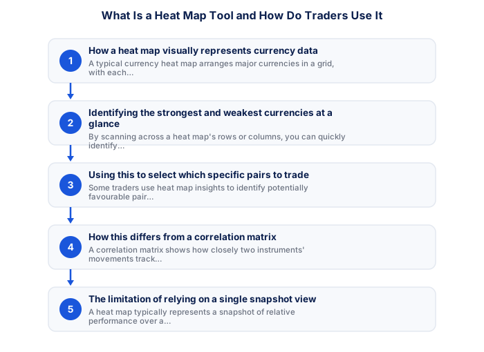
- How a heat map visually represents currency data
- Identifying the strongest and weakest currencies at a glance
- Using this to select which specific pairs to trade
- How this differs from a correlation matrix
- The limitation of relying on a single snapshot view
- Where to access this kind of tool practically
1. How a heat map visually represents currency data
A typical currency heat map arranges major currencies in a grid, with each cell showing the relative performance between two specific currencies, often colour-coded from one extreme (strong, perhaps green) through neutral to the opposite extreme (weak, perhaps red), allowing rapid visual scanning across many currency relationships simultaneously without needing to check each pair individually.
2. Identifying the strongest and weakest currencies at a glance
By scanning across a heat map's rows or columns, you can quickly identify which specific currency is showing the most consistent strength across its relationships with multiple other currencies simultaneously, and which is showing the most consistent weakness, providing a rapid overview that would otherwise require checking many individual pairs separately.
- Two-factor authentication enabled
- Unique password not shared with other sites
- Broker mobile app installed and tested
- Mobile data backup connection tested
- Price alerts set for active instruments
- Broker emergency number saved in phone
- Know how to close all positions in under 30 seconds
- Desktop: full charting, multi-monitor, all order types
- Mobile: real-time monitoring and load shedding backup
- Mobile: price alerts when away from desk
- Desktop: useless during load shedding without UPS
- Mobile: limited charting for detailed analysis
- Mobile: higher risk of fat-finger errors
- Full charting and analysis
- Best for trade entry
- Multi-monitor support
- More order types available
- Monitor and manage on the go
- Load shedding backup use
- Push price alerts
- Limited charting tools
3. Using this to select which specific pairs to trade
Some traders use heat map insights to identify potentially favourable pair combinations as part of a broader trading strategy, for example, pairing a currency showing broad strength against one showing broad weakness might offer a more clearly-directional setup than pairing two currencies showing more mixed or moderate relative performance against the broader market.
| Feature | MT4 | MT5 |
|---|---|---|
| Broker availability | Very wide | Growing |
| EA library | Largest available | Smaller but growing |
| Timeframes | 9 built-in | 21 built-in |
| Asset classes | Forex and CFDs | Forex, CFDs, stocks |
| Mobile app | Good | More modern UI |
4. How this differs from a correlation matrix
A correlation matrix shows how closely two instruments' movements track together over time, while a heat map specifically shows current relative strength or performance at a given moment, these are related but distinct concepts, with the heat map being more useful for identifying current directional opportunities, and the correlation matrix being more useful for risk management and diversification assessment.
5. The limitation of relying on a single snapshot view
A heat map typically represents a snapshot of relative performance over a specific recent period, which can shift meaningfully as new data and price action develops, relying on a single, static snapshot without checking how this picture has evolved or might continue evolving risks basing a trading decision on potentially outdated or rapidly-changing information.
6. Where to access this kind of tool practically
Many charting platforms and dedicated financial websites, offer free currency heat map functionality, often updated continuously with live market data, removing the need to manually compile this kind of comparative overview yourself across numerous individual pairs.
A currency heat map provides a fast visual overview of which currencies are relatively strong or weak. It's most useful for confirming a directional bias, not as a standalone entry signal.
★ Why It Matters
Worth using specifically rather than just glancing at: check whether a currency's apparent 'strength' on the heat map is broad-based across many pairs or concentrated in just one or two, broad-based strength is generally a more reliable signal than strength against a single weak counterpart.
✕ Common mistakes
- Using heat map readings without checking the underlying timeframe. Strength shown can reflect very different timeframes depending on settings.
- Assuming heat map data updates as frequently as your trading platform. Update frequency can vary between tools.
- Treating heat map output as a standalone trading signal. It works best as one input alongside other confirming analysis.
Analytical tools and frameworks add value only to the extent that they improve your actual trading decisions rather than providing reassurance or filling time between trades. The most effective approach to adopting new analytical tools is to paper-trade with them for a defined period, comparing outcomes against your results without the tool, before integrating them into your live trading process. South African traders should additionally assess whether any tool they consider incorporates SA-specific data sources, particularly SARB data, JSE specific feeds, and local economic calendar data, since global tools default to non-ZAR market data that may not fully capture the drivers relevant to their primary instruments.
Key Takeaways
- A currency heat map visually displays relative strength across multiple pairs simultaneously, helping traders quickly identify which currencies are leading or lagging.
- A currency heat map visually displays relative strength or weakness across multiple currency pairs simultaneously, typically using colour coding.
- This helps traders quickly identify which currencies are currently leading or lagging.
- How a heat map visually represents currency data.
- Identifying the strongest and weakest currencies at a glance.
The market data widget offers a similar overview of relative currency strength and is free to embed on any site.
Frequently asked follow-up questions
Are heat maps available for free?
Yes, many charting platforms and financial websites offer this functionality without requiring a paid subscription.
Can heat maps be used for instruments beyond forex?
Some platforms extend this visualisation concept to other instrument categories, including commodities and indices, though it's most commonly associated with currency analysis specifically.
Should beginners rely heavily on heat maps for trading decisions?
Heat maps work best as one input within a broader analytical framework, rather than a standalone, sufficient basis for trading decisions on their own.
